I stood at the back door and felt that rare, pleasing click: this garden layout looks calm, centred, and somehow “finished”. The garden paths are tidy and symmetrical, guiding your eye exactly where the designer wants it to go. The problem is they guide your feet the same way - and after a week of actually using the space, that starts to feel less like elegance and more like a polite restriction.
It’s the classic trade-off. Balance gives a garden a sense of order, especially in small plots where chaos reads as clutter. But movement is what turns a garden from a picture into a place you live in.
What works: the layout has a strong “centre of gravity”
A balanced plan usually does three things well, and this one hits all three. There’s an obvious focal point (often a patio, a feature tree, a water bowl, even a bench), planting is mirrored or repeated so nothing feels lopsided, and edges are tidy enough that the whole space reads larger than it is.
That matters because most gardens aren’t viewed once. You see them from the kitchen sink, from the sofa, from upstairs. A layout that holds together from multiple angles lowers the visual noise, which is why it feels restful.
You can almost tell what the original brief was: “Make it neat. Make it easy. Make it feel like a proper garden.” On that front, it succeeds.
Where it pinches: movement becomes a single, approved route
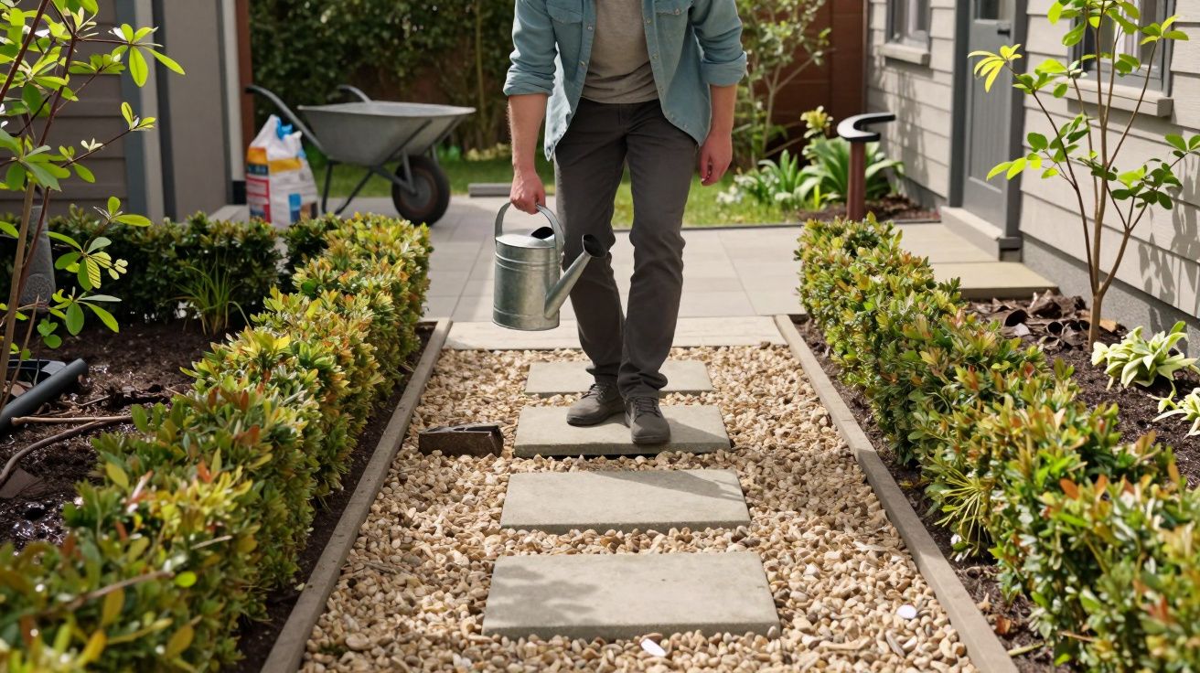
The issue shows up in real life scenarios, not on a plan. You carry a watering can out and realise you have to take the long way round because there’s no cut-through. You’re deadheading near the border and end up doing that awkward sideways shuffle so you don’t step off the paving. Two people try to pass each other and one of you ends up in the planting like a guilty Labrador.
When garden paths are designed more for symmetry than for circulation, you get a space that photographs beautifully but behaves like a corridor. It’s not that you can’t move - it’s that you can only move in the way the layout permits.
Common tells:
- Paths that end in a “destination” but don’t connect back into a loop
- Narrow widths (fine for one, annoying for two, impossible with a wheelbarrow)
- Hard right-angle turns that force you to slow down and pivot
- Planting beds that bulge into the route at the very points you naturally want to pass
Let’s be honest: no one notices this on day one. You notice it on the fifth trip to the compost bin.
The hidden cost: maintenance becomes fiddlier than it needs to be
Restricted movement doesn’t just affect enjoyment; it affects how you care for the space. If you can’t approach a bed from more than one side, you’ll overwork the same spots and ignore the awkward ones. If a path is tight, you’ll avoid bringing tools through it. If the route is a straight run, you’ll drag hoses across planting to reach corners.
Over time, the garden starts to develop a “used hard / used never” pattern: compacted soil along the approved route, and neglected pockets where access is annoying. That’s when balanced gardens can paradoxically begin to look less balanced - not in design, but in wear.
A simple test is to imagine doing these jobs after rain, in boots:
- moving a bag of compost
- sweeping leaves
- pruning shrubs
- taking garden waste to the bin
If your imaginary self is muttering, the layout is telling you something.
How to keep the balance but regain flow
You don’t need to rip everything out. You need one or two permission slips for movement - discreet, practical adjustments that don’t break the “calm” of the design.
1) Add a loop (or at least a second route)
A loop doesn’t have to be a big circle. It can be a stepping-stone return path behind a bed, or a narrow side run that reconnects to the patio. The psychological effect is immediate: the garden becomes navigable rather than linear.
If you can only add one change, add this one. A space that lets you wander will always feel larger than one that forces you to march.
2) Widen the pinch points, not the whole path
Often it’s not the entire path that’s too narrow - it’s the pinch near a gate, the corner by the raised bed, the squeeze past a feature pot. Widening just those areas keeps the overall symmetry but stops the daily friction.
As a rule of thumb:
- comfortable single-person movement starts around 90cm
- side-by-side passing becomes pleasant closer to 120cm
You can cheat the look by flaring the path subtly at tight points, rather than making everything uniformly wide.
3) Use “soft crossings” to create choice
If the design relies on clean lines, you can still introduce shortcuts without adding another formal path. Think:
- a small line of stepping stones through gravel
- mown stripes through lawn (allowed to be seasonal)
- bark chip routes through productive areas
- a discreet gap in planting that reads as intentional, not accidental
The goal isn’t more hardscape. It’s more options.
4) Relocate destinations to match real behaviour
Sometimes the path is fine; the destination is wrong. If the compost bin, shed, or water butt sits just off the end of the “pretty” route, you’ll constantly deviate and trample an unofficial trail into being.
Move the practical things to meet the flow, or acknowledge the flow by formalising the route people naturally take. Gardens always win these arguments.
A quick check-in box before you change anything
Walk the garden as if you’re doing the dull jobs, not enjoying the view. Notice where you hesitate, turn back, or step off the path.
- Where do you naturally want to cut across?
- Where do you slow down because it’s tight?
- Where do you avoid going at all?
- What route would a wheelbarrow choose, if it could vote?
The answers are rarely dramatic. They’re small irritations, repeated until they shape how you use the whole space.
What better looks like
The best gardens manage both: they hold a balanced composition and they give you freedom. They let you take the neat route when you want order, and a quicker route when you want practicality. They don’t make you feel like you’re breaking the design just to live in it.
If this layout feels balanced but limits movement, treat that as a useful diagnosis, not a failure. Balance is hard-won. Flow is usually one smart edit away.


Comments (0)
No comments yet. Be the first to comment!
Leave a Comment